
Texture Photos
Image 1) Alter in Lightroom

Image 2) Alter in Lightroom

Image 3) Black and white filter preset

Image 4) Double Exposure
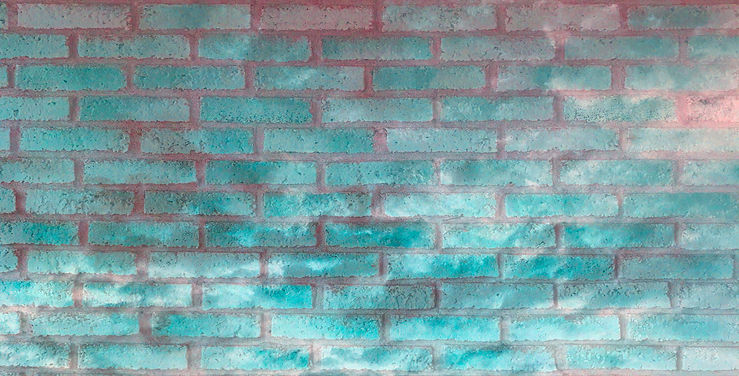
Image 5) Double Exposure

Image 6) Double Exposure with one normal photo

Image 7) David Hockney

Refection
I believe that my images do make the viewer want to reach out and touch them because of all the different textures I combined and my really close up shots where you can see the tiny details. I really like my double exposures because of the bright colors on my brick/ cloud texture and the combination of two completely different textures on my keyboard/ fur photo (really hard and the other super soft). For my brick image, I turned up the saturation on both layers and then made sure to make the contrast really high on my cloud layer so it would be easier to see. For my other double exposure, I used the saturation and brightness tools on the fur layer because I really wanted to define it more and then finished with a purple filter so it was more interesting than just black and white. I do like image six because of the contrast between the leafy/ tropical print against the pillow. I would change the amount of my dogs body you can see just because it's so zoomed in. I love image seven because it's so colorful and the mixture of prints allow you to look at it for a long time trying to find them all. The weird edge look is one of my favorites because it changes your whole perspective of an image and makes it more unique/ interesting. My favorite image is the David Hockney inspired one because it reminds me of his style and I like the color scheme. Plus, it was taken at Disney which is one of my favorite places to go so it reminds me of it every time I see this photo